Bridging 10 studies into 1 visual concept
Introduction
The University of Maryland, Baltimore County releases a student led research journal every year called the UMBC Review. I had the privilege of designing the 25th volume, which featured 10 papers, ranging from sociology to quantum physics. The challenge was to create an overarching concept that bridges each author’s unique position, while also celebrating the diversity of knowledge.
Type of Project / Category: Book design, promotional campaign,
Year: 2024
Client: University of Maryland, Baltimore County
Role: Typesetting, user testing, creative direction, photo-manipulation, motion graphics
The Cover Design:
A Metaphor for Processes
A Metaphor for Processes
Organic Minimalism
I chose an organic, minimalistic visual language to evoke the essence of academic exploration. The cover needed to resonate with both seasoned researchers and curious undergraduates. By embracing simplicity, I aimed to convey the idea that knowledge, like nature, unfolds through gradual processes.
The Lily Flower as a Symbol
The lily flower became our central motif. Its delicate petals symbolized growth, discovery, and the unfolding of ideas. The stylistic choice of the lily plays into the theme of processes, relating back to research. The lily flower, shown as a negative, ties into the film development process, relating to notions of steps, just as in a research journey.
User Testing
How do you read a book?
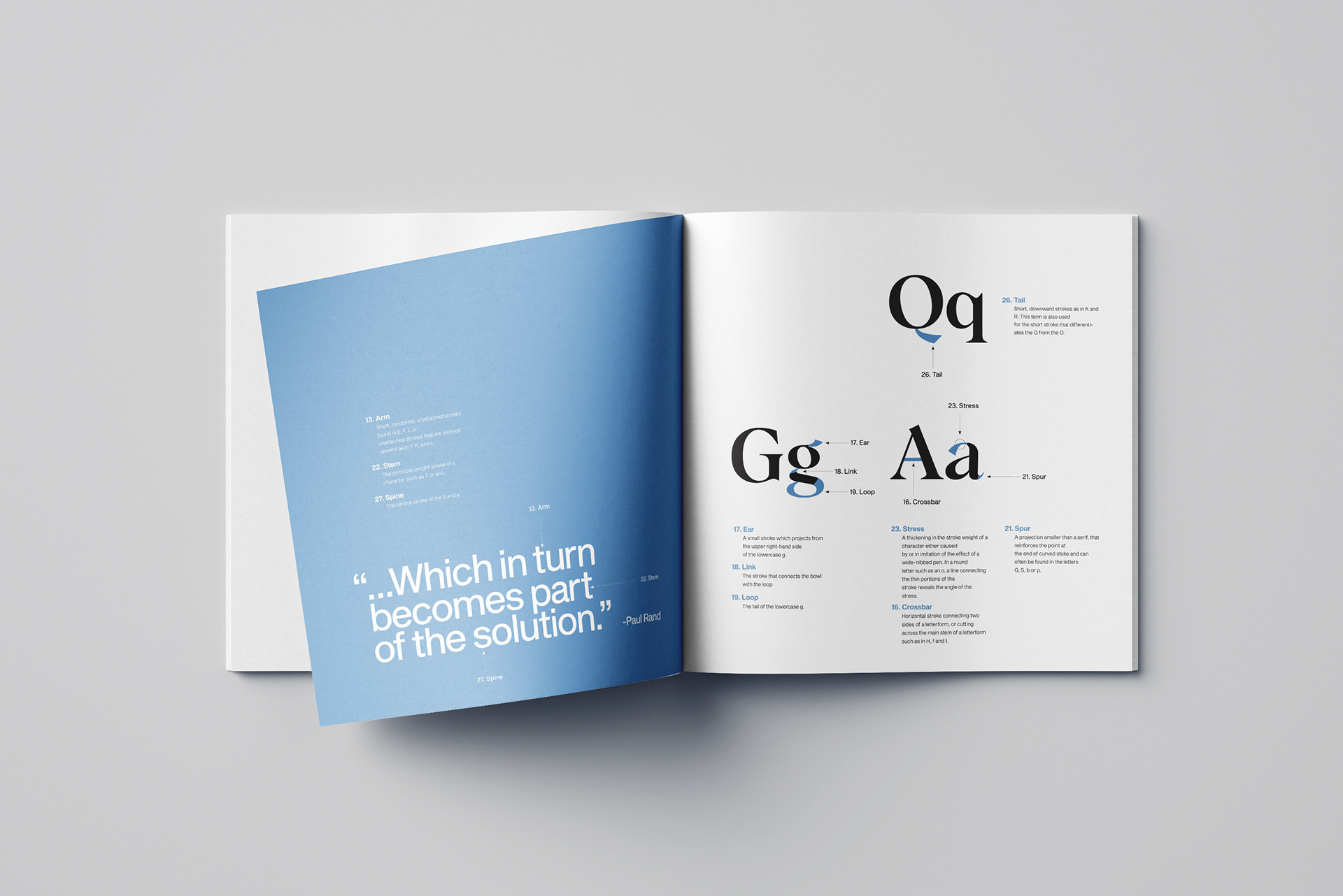
To ensure reader comfort, I conducted user testing with my roommates. I presented them with different interior designs, each featuring varying font and margin settings. I asked them to simply read a page from each version. Then I asked them which felt the most comfortable. The deciding factor funneled down to the margins. The participants mentioned the importance of thumb placement. They wanted ample space for their thumbs to rest without obscuring the text.
Reader-centric design
The 2:1 Ratio
Based on the user feedback, I decided on a 2:1 ratio for the margins of the text body. This deliberate asymmetry allowed readers to comfortably hold the book near the bottom, while also preventing text distortion near the spine.
Getting the word out
Countdown posts
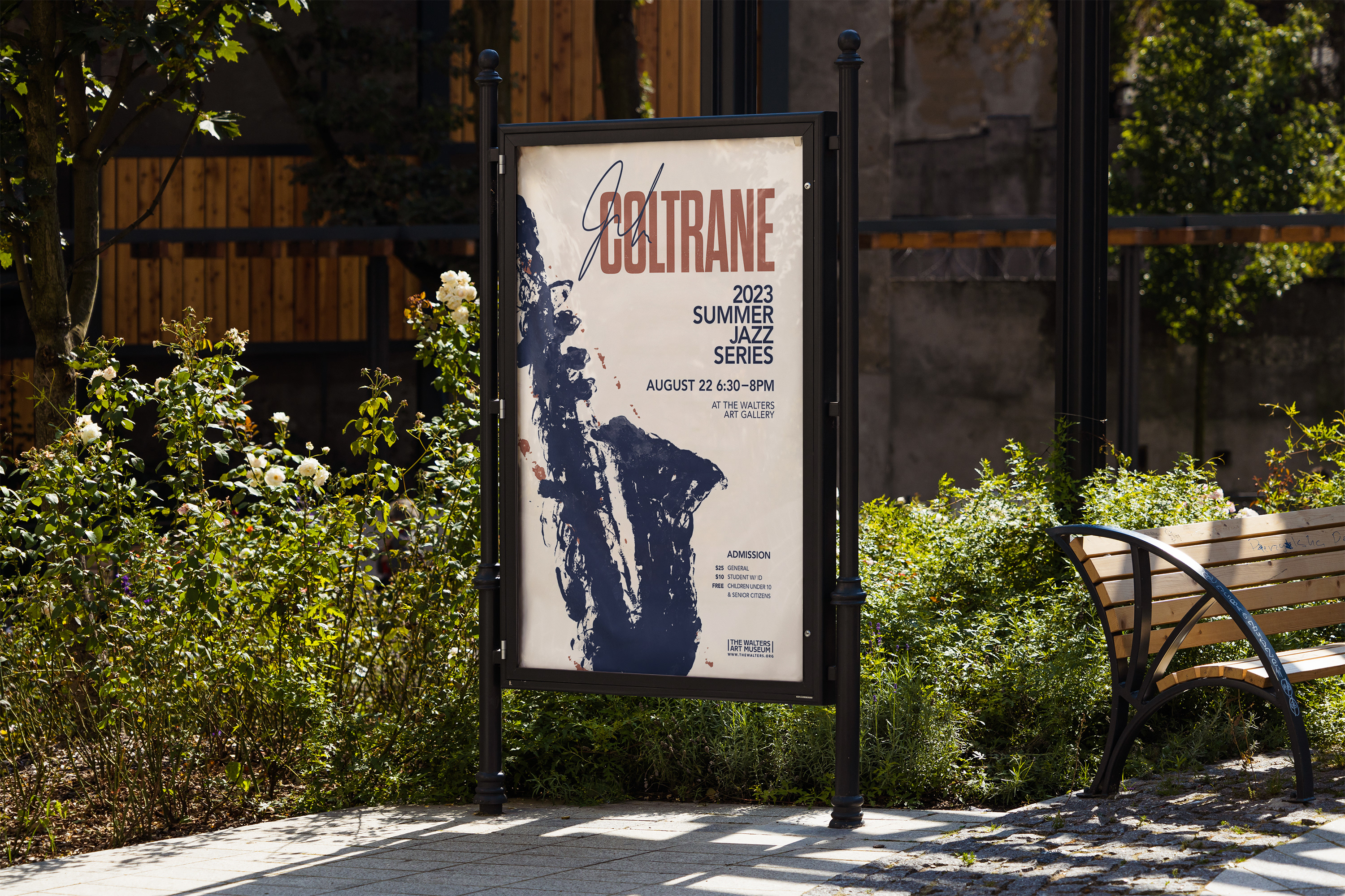
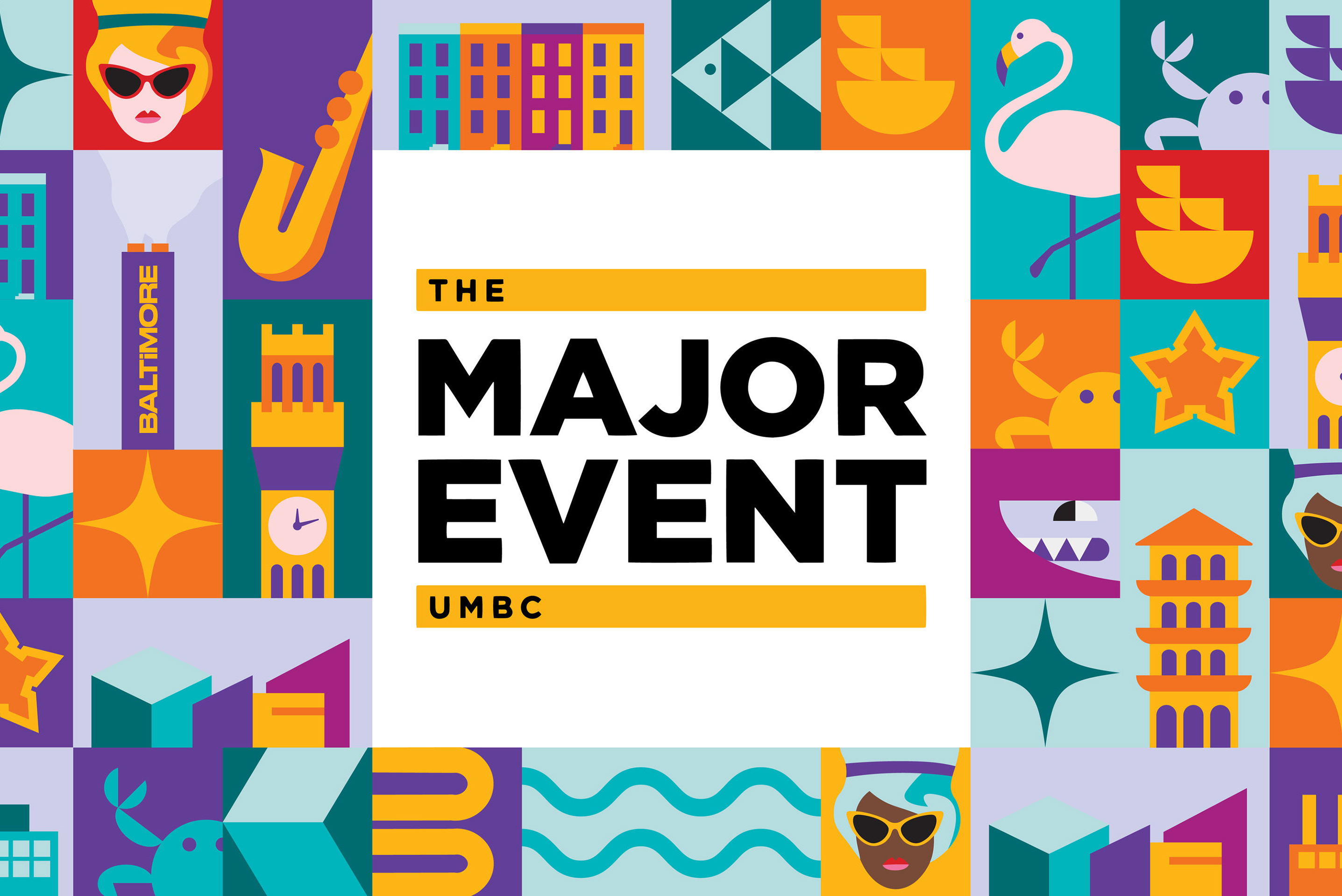
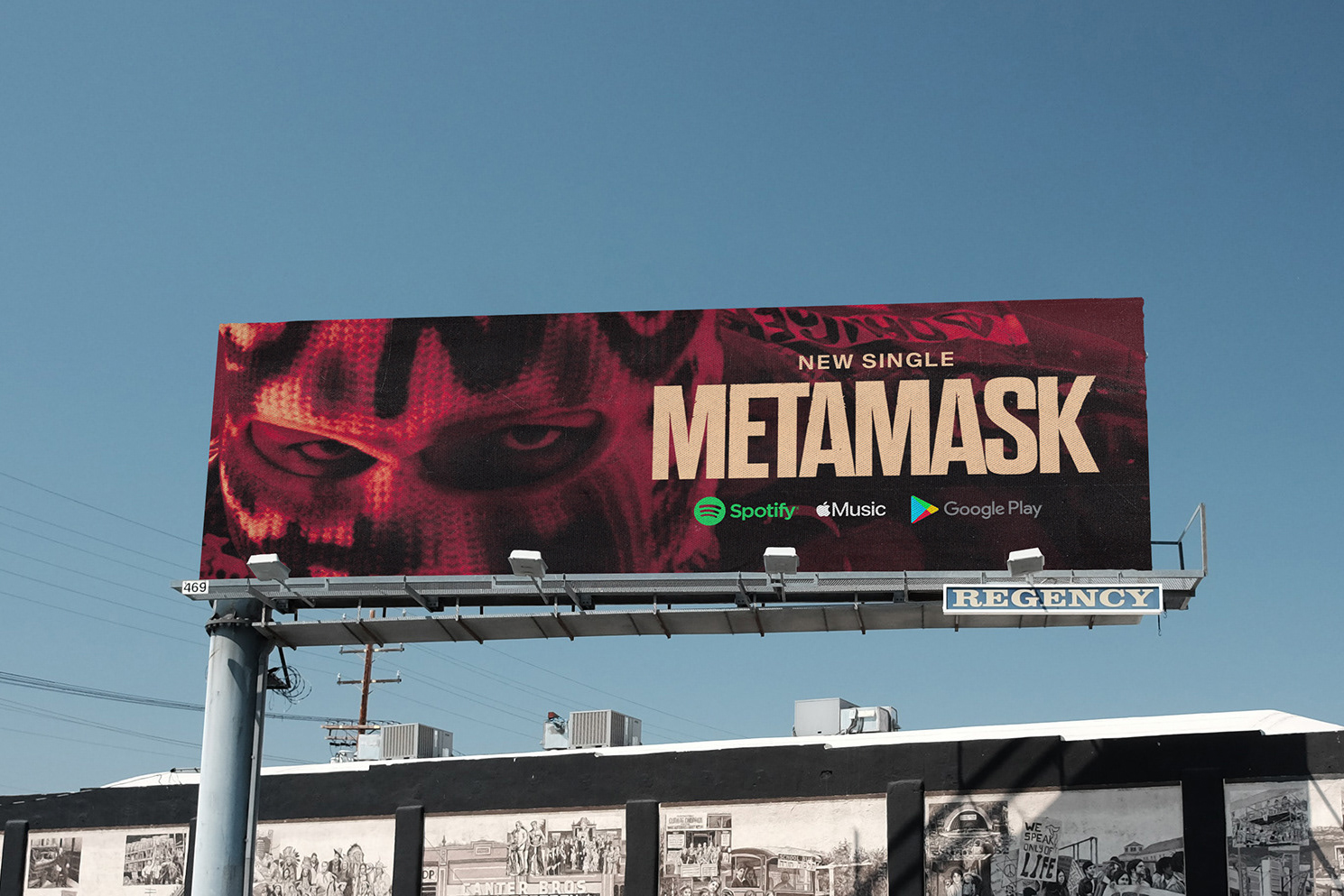
In order to get the word out, I made a combination of still images and motion graphics for the university to post on social media. I created various formats to use on the official UMBC website, and Instagram stories.


